
Modern mortgage website designBrowse the mortgage website gallery →
Stand out from every navy mortgage site in your market
The Summit Crest layout in a warm rose palette, with the same full loan menu and plainly labeled pricing.
- Pages
- 53
- Screens below
- 5
- Status
- Live
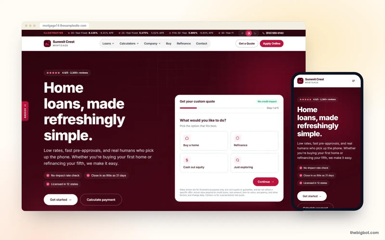
Every screen of Summit Crest Rose
Captured from the live Summit Crest Rose demo: the rose-palette home page, numbered loan options, about and contact.




Where Summit Crest Rose wins
Summit Crest Rose is the rose-colored edition of Summit Crest. It suits a lender or broker whose brand is warmer than the usual navy and blue, and who wants a premium feel with the same full loan menu.
Brands that want a warmer, premium lookA palette nobody else in the set uses
Rose and burgundy read as premium next to the blue every competitor is using, which is half of being remembered.
Numbered menus that stay calm
Grouping loans in numbered sets keeps a long product list from feeling like a list.
Disclosures written out
Sample pricing is spelled out in plain language, which ages better than a fine-print line.
Also on the site
Rose palette. A warm, premium color system instead of standard navy.
Numbered loan menus. Conventional, government and specialty loans in numbered groups.
Labeled sample pricing. Illustrative rates written out with plain disclosure text.
Blog and team pages. Ready for your articles and loan officer profiles.
What makes a mortgage website look modern and stay readable
Modern is mostly restraint. These are the choices behind Summit Crest Rose, and the standard that keeps a distinctive palette usable.
Contrast before color
Body text needs a contrast ratio of at least 4.5 to 1 against its background under WCAG 2.1 AA. A warm palette only works if the text still passes.
One accent, used consistently
Rose carries buttons and links, burgundy carries headings, and nothing else competes for attention.
Disclosures readable, not hidden
Sample pricing is written out in plain text at a readable size, which ages better than a fine-print line.
Built for the phone
Numbered menus collapse cleanly on a small screen, where many borrowers first see the site.
Sources: WCAG 2.1 contrast (minimum).
Rebuilding Summit Crest Rose as your site
Rose is the warmer edition of Summit Crest, so the rebuild is mostly a color decision: keep the rose, or redraw it in your palette.
- Palette kept or redrawn. The rose and burgundy system stays, or is rebuilt in your brand colors with the same contrast between text and background.
- Numbered menus filled. Your programs go into the numbered conventional, government and specialty groups.
- Disclosure text in your words. The plain-language sample pricing disclosures are rewritten by your compliance lead, or removed along with the pricing.
Pick Summit Crest Rose if
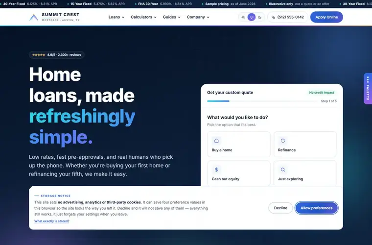
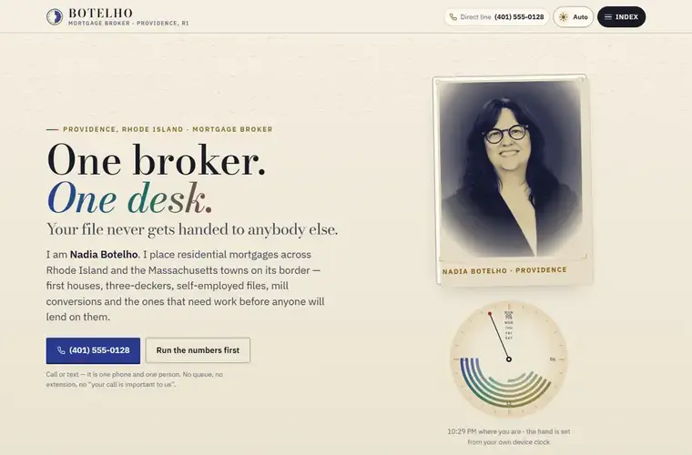
If not, Summit Crest or Botelho may suit you better.
- Your brand is warmer than the usual mortgage navy
- You want a premium look without a custom build
- You like the Summit Crest structure but not its color
Questions about Summit Crest Rose
Can Summit Crest Rose use my brand colors?+
What is the difference between Summit Crest and Summit Crest Rose?+
What makes a mortgage website design modern?+
Can I get the Summit Crest layout in navy?+
Launch Summit Crest Rose as your website.
A warmer mortgage brand, rebuilt in your colors on your own domain.
Book a Demo →